Grid
<Grid /> is an infinitely nestable column layout container. By default it has no margins or paddings but they can be added as needed using the margin or padding parameters. The columns defined are always relative to the container, not the parent element.
It is available both, as a hook (see useGrid) and as an individual component (see Grid).
API
All parameters are optional
| Parameter | Type | Valid Values | Default |
|---|---|---|---|
| align | String / Object | start / center / end | |
| base | Number | 8 | |
| direction | String | column / row | row |
| justify | String / Object | start / center / end | start |
| margin | Array / String / Number / Object | [0] | |
| padding | Array / String / Number / Object | [0] | |
| ref | Function | ||
| size | Number / String / Object | [1, 12] / fit / auto | 12 |
| show | Array / String | ||
| paddingTop | Number / String / Object | ||
| paddingRight | Number / String / Object | ||
| paddingBottom | Number / String / Object | ||
| paddingLeft | Number / String / Object | ||
| marginTop | Number / String / Object | ||
| marginRight | Number / String / Object | ||
| marginBottom | Number / String / Object | ||
| marginLeft | Number / String / Object |
Note that the Object type defined on the properties above applies only when working with responsive layouts where the keys of the object are one of the keys of displayAliases and values the value to apply when the resolution matches. For instance <Grid paddingTop={{ large: 3, small: 2 }} /> is only valid if there is a large and a small display alias defined in .
Also note that all spacing properties can use spacing aliases to define spacing values.
Align
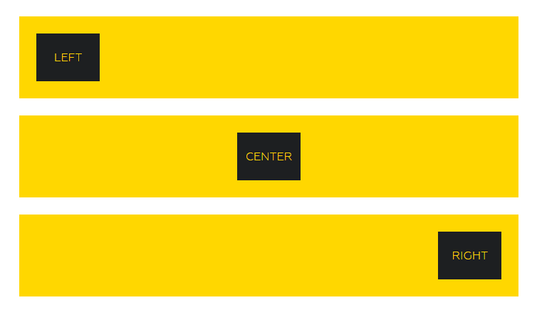
Vertically aligns the contents of the Grid:

https://gymnastjs.github.io/gymnast/?path=/story/grid--align
Base
Indicates the default value to multiply spacing values with. i.e. if base is 8, a margin={2} value becomes margin: 16px.
The default is 8 but it can be changed through . base or specifying it directly on the <Grid />. One should rarely need to be changed directly on a given component since the goal is for it to be consistent with the rest of the grid.
Direction
Direction indicates whether child <Grid /> are placed in the container, either stacked vertically or horizontally). It behaves very like flex-direction.
Justify
Horizontally aligns the contents of the Grid.

https://gymnastjs.github.io/gymnast/?path=/story/grid--justify
Ref
ref is used to pass a ref to the underlying div within <Grid /> the Component.
Spacing
There are 2 ways to define separation between Grids, padding and margin. They are both defined following css syntax as explained in the spacing section.
Margin
It's a shorthand for setting marginTop, marginRight, marginBottom and marginLeft individually. Values set represent multiples or fractions of base (8px). E.g. margin={1} is equivalent to margin: 8px in css. Similarly, margin="1 0" will set vertical margin to 24px and horizontal one to 0.
Check the formats section in spacing to see the different valid values.
Spacing aliases can be mixed with non alias values. For instance margin="L 2 0" is valid and so is margin={['L', 2, 0]}`.
Padding
It's a shorthand for setting paddingTop, paddingRight, paddingBottom and paddingLeft individually. Values set represent multiples or fractions of base (8px). E.g. padding={1} is equivalent to padding: 8px in css. Similarly, padding="1 0" will set vertical pading to 8px and horizontal one to 0.
Check the formats section in spacing to see the different valid values.
Spacing aliases can be mixed with non alias values. For instance padding="L 2 0" is valid and so is padding={['L', 2, 0]}`.
margin[Direction] / padding[Direction]
A number or a spacing alias indicating the margin / padding to apply on that direction as a multiple of base.
gutter / verticalGutter
gutter and verticalGutter are aliases automatically exposed to Grid and map to gutter and verticalGutter values defined by GymnastProvider. gutter/2 and verticalGutter/2 are also valid, and map to the corresponding config values, but divided by 2.
Size
This parameter indicates the number of columns to size this component. The value can range from 1 through the number of columns used (defaults to 12).
There are 2 additional sizing options that cause an element to break its normal flow within the grid:
fit: To size to fit the content (regardless of columns)auto: To evenly divide the remaining space with other elements.
You can see usage examples of 'fit' on the tab navigation on the fit page example.
Updated about 6 years ago
